Why the two belong together
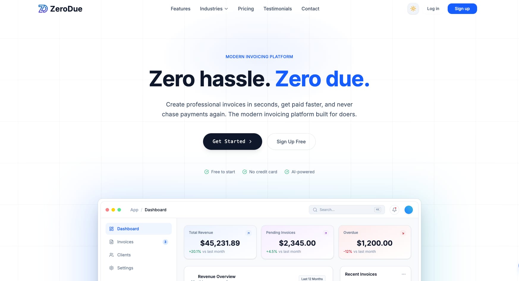
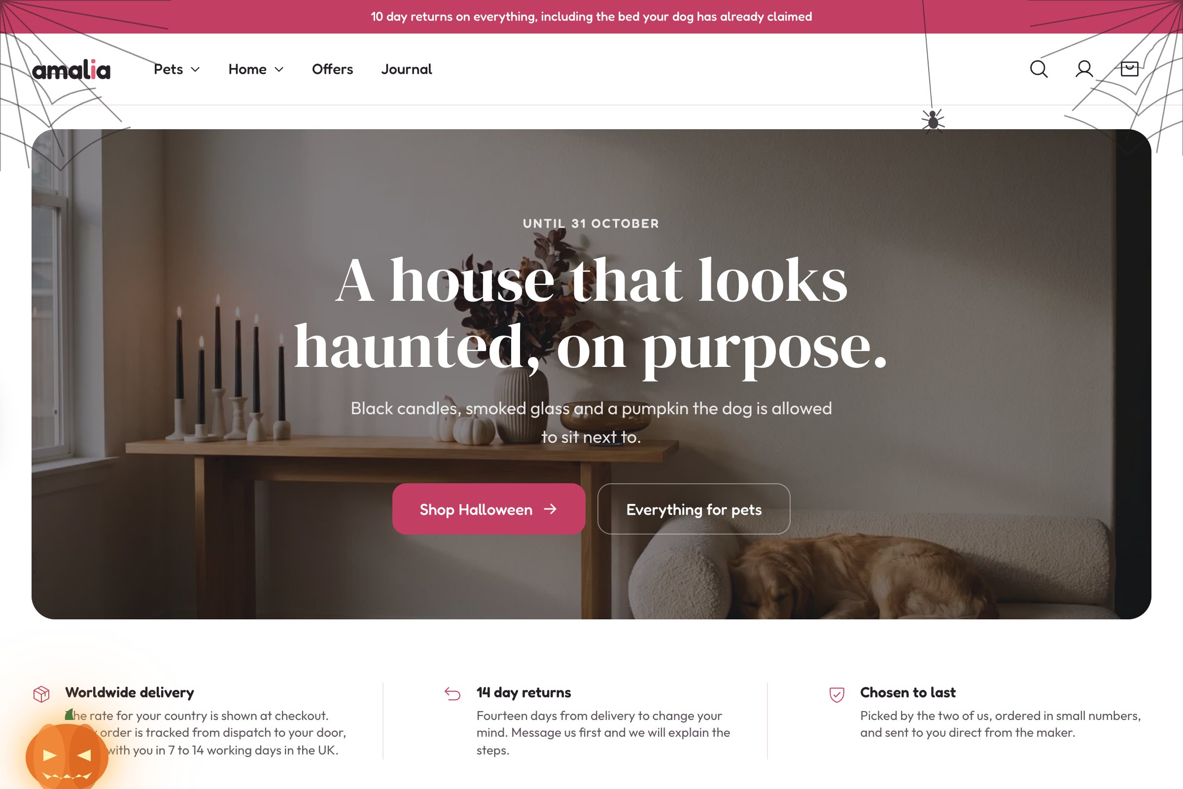
A logo that works on a business card can fall apart at the size a mobile header allows. A colour palette chosen on a calibrated monitor can fail accessibility contrast requirements the moment it becomes body text. A typeface picked from a specimen sheet can add half a second to your load time when it's a web font with six weights.
These aren't hypothetical problems — they're the standard set of compromises that show up when brand work is handed over the wall. Designing both together means the identity is tested against real constraints while it's still cheap to change.